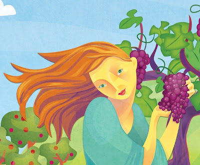
 A closer peek at the illustration. You can see the texture I've layered over the vector art as well as some of the added details like apples on the trees, striations in the sky and, of course, more bountiful grapes!
It is always a balance between what the client wants in the illustration and staying true to your vision, your style, your experience with what makes good art. My work is generally large shapes, "bad-tangents" and the play and movement between positive and negative space. I'm not an artist who fills an image with detail. Details for me are shifts in temperature or value. As an illustrator, I enjoy creating art for a purpose, for a client, for specific sizes... bring on the limitations :D
 My great opportunity has proven to be a wild ride. It has had so many twists that just like life, you think you know where you are headed and then you find yourself someplace else :D After concepts and sketches were approved and designs explored it was finally time to begin illustrating! The fun part!
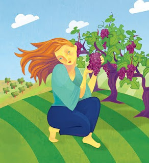
I've been working digitally for years but rarely do I get the opportunity to create a real painting completely digitally. I was excited! (I create artwork in my day job digitally but they are either icons or vector spot illustrations, and not 'painterly' or as fully developed or high res as you would want for print.)The job was for a series of products in the health and beauty industry. There would eventually be 5-7 product lines the client imagined. Yeah! I love working in series! We began with the first to debut, a product that contains a powerful antioxidant from grapes. I created the artwork almost completely in Adobe Illustrator. I did add a layer in Photoshop of texture, a screen of a photo I took of a plaster wall. This added a softness and a 'toothy' feel like it was painted on a heavy rag paper. I liked the effect a lot.
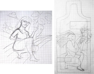
It's one thing to sketch out an idea for a painting and then if you are an illustrator you have the added confines of space, layout, overlays of text or graphics.I always start with a very rough sketch of what I'm picturing in my head. This is simply a communication between my imagined painting and my hand. I only need to quickly let a rough image flow from my head to my hand and paper and then I can move on to a more refined sketch.Left sketch is the initial pouring of my idea to paper and then on the right I've refined it more and placed it on a thumbnail template of the most limiting conditions of the layout... which for this project was the product pouch. Very tiny.

 A closer peek at the illustration. You can see the texture I've layered over the vector art as well as some of the added details like apples on the trees, striations in the sky and, of course, more bountiful grapes!
